Getting Started With Typeshift
Get the first important things down quickly – type and color.
- Introduction
- Managing Text Elements
- Styling Text
- Selecting & Saving Fonts
- Variable Fonts
- Opentype features
- Code Panel
- Mobile Previews
Hi there! Typeshift helps you make better typographic decisions on the web. It puts typography first in the design process so you can make sure you’re building on the right baseline.
Typeshift’s features revolve around rapidly generating typographic ideas and testing them in a responsive environment. That means surfacing things like text content, CSS styles, variable fonts, Open Type features and reflecting those settings live in code.
Key Command: While Typeshift saves your work periodically, Command + S will save your progress immediately.
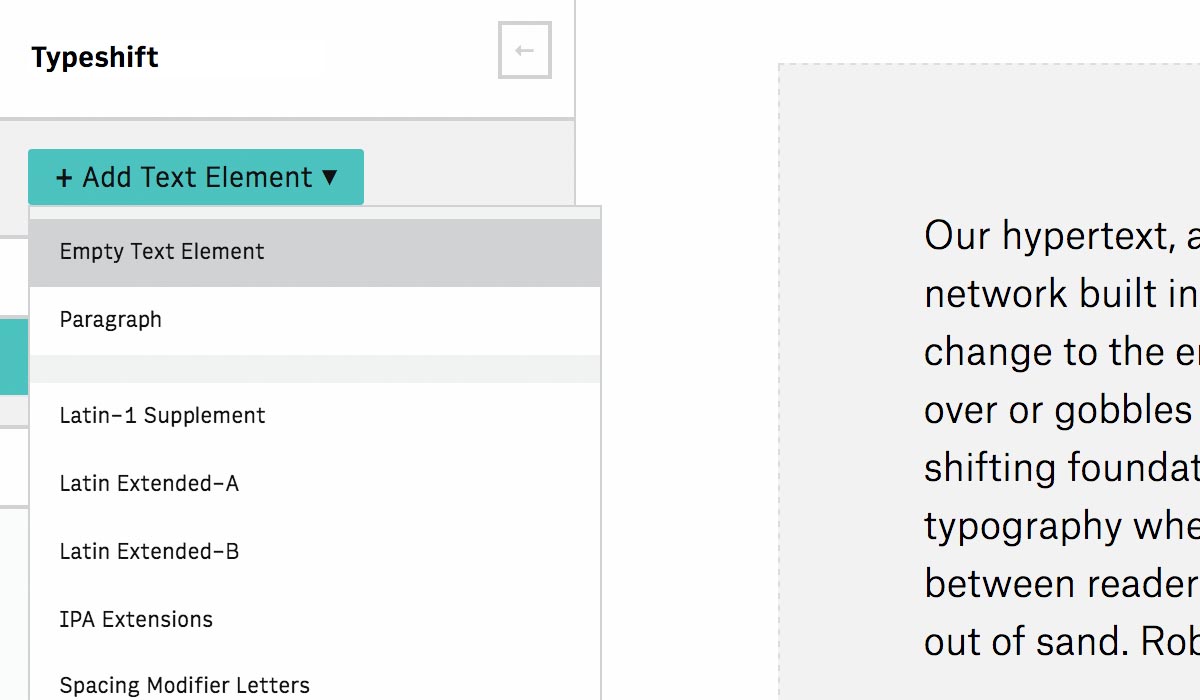
Typeshift has a number of default content / characters that can be added. It has no layers, instead, blocks of content behave just like they would as they would as styled HTML on a web page.
Text can be added easily by clicking the drop down in the top left. Empty text boxes and text boxes with placeholder text can be added this way. Placeholder content and other alternate characters and languages can be created this way as well if you’d like to test how a font supports these.
Hover over a text element to show the buttons for duplicating or deleting that element.
Type designers can take advantage of character sets for proofing fonts.
Typeshift uses native styles, relative units and controls for Responsive Design so it accurately reflects how your type will actually appear to users.
Everything in Typeshift is web native. CSS styles can be set on the sidebar and update the design live. This means you can open Typeshift in different browsers and resize the window to see how your fonts work responsively. You can also take advantage of relative and responsive viewport units like em and vmax!
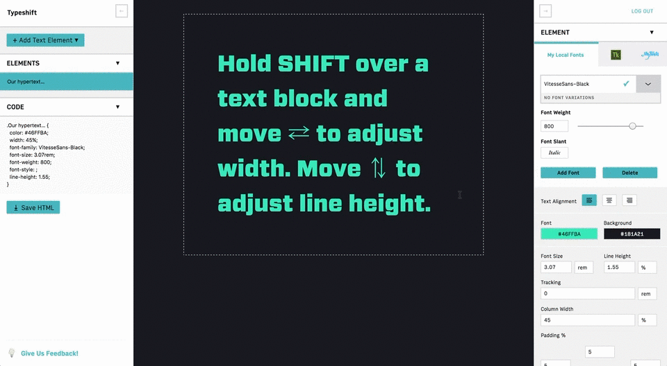
Key Command: Typeshift also introduces some new design conventions. Hold SHIFT over a text block and Move ⇄ to adjust width. Move ⇅ to adjust line height. This is super nifty for quickly finding the right balance between width and line height for a block of text.
Hint: Use the and buttons to toggle the panels closed so you can prevew your type lockup.
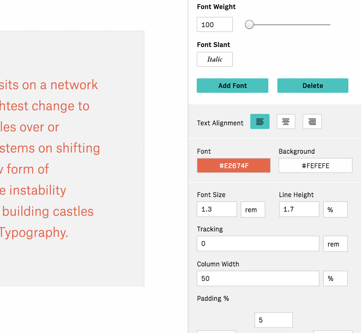
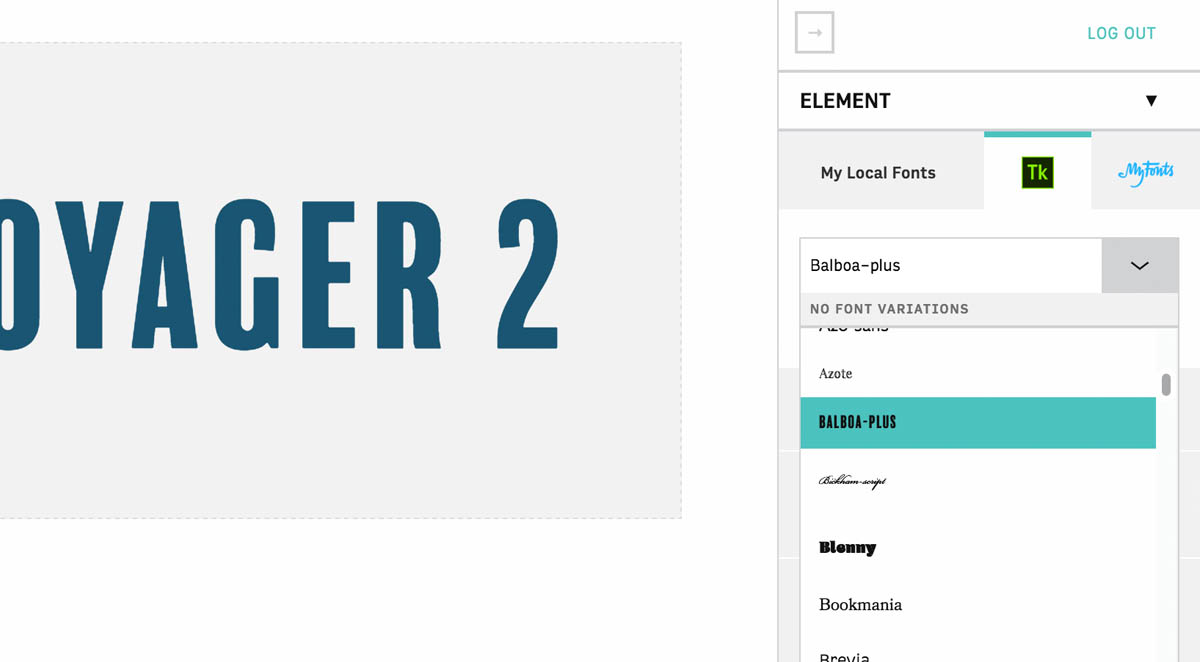
Typeshift lets you design with local fonts on your computer or through Typekit and MyFonts. With font selection our goal is quality over quantity.
Type the name of a local font and Typeshift will confirm and apply it to your text box. From there you can save fonts with and remove them from your list with . Use the slider to adjust weight and ’font slant’ to toggle italics.
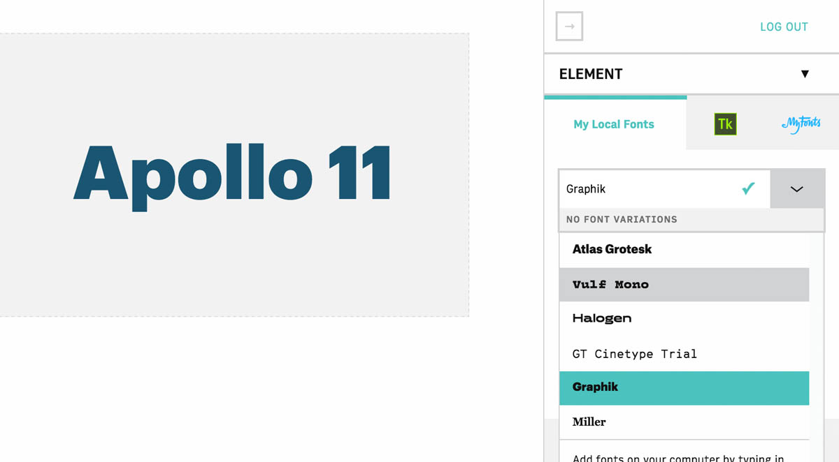
Typekit works the same way!
Typeshift was built with Variable Fonts in mind.
Variable Fonts provide a new way to design with and deliver context aware fonts to users. You can start experimenting with early UI for Variable Fonts now by using Typeshift on Safari Technology Preview. Select the tab and pick one of the Variable Fonts from the dropdown. From there you’ll see a panel where you can adjust your font in a similar fashion to picking colors on a color picker! Moving left or right on the panel adjusts different parts of the font.
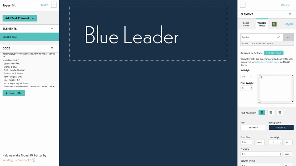
Huge thanks to the respective designers for their Variable Fonts!
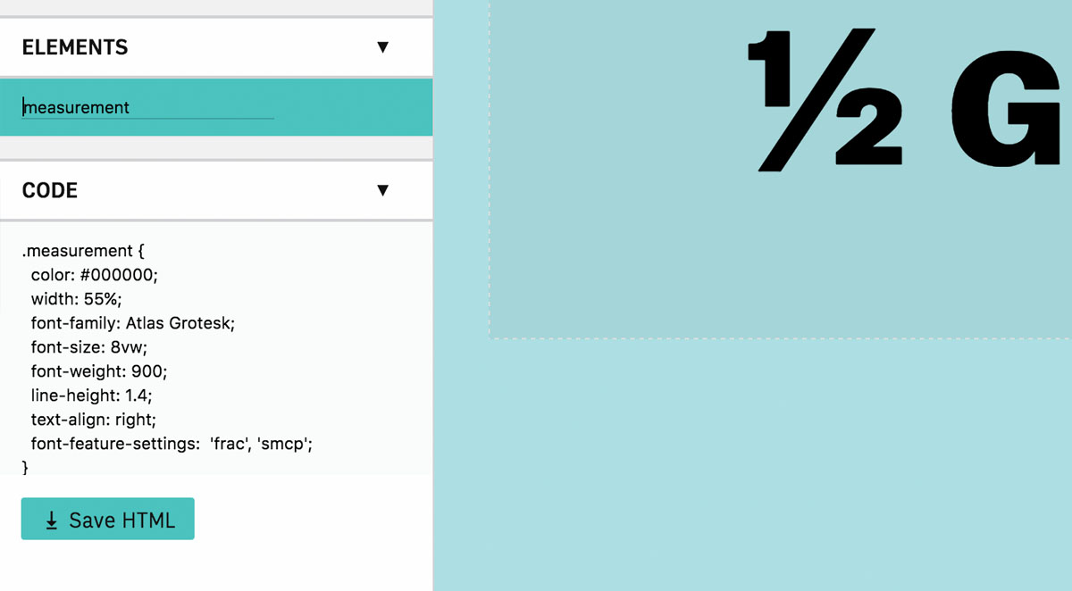
Typeshift brings CSS OpenType features like ligatures, fractions and stylistic alternates to the forefront.
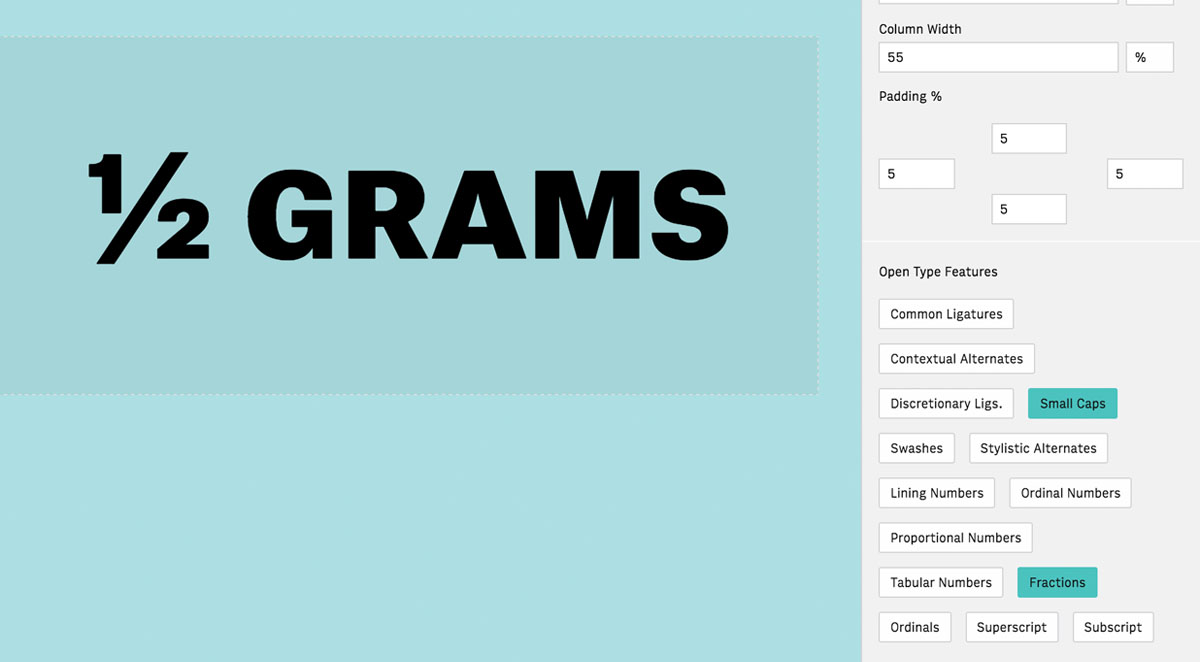
OpenType features are easily accessible underneath the style settings. Just click the buttons to toggle that OpenType feature. That’s it!
Moving seamlessly between Typeshift and production code is easy. Any design changes made in Typeshift are immediately reflected in the code panel for copy and pasting. Custom CSS class names can be added by double clicking on a text element and changing the name.
HTML can also be exported via .
If you open Typeshift on your mobile device, it will automatically sync your project with changes made on desktop. This is a great way to see how your lockup looks at smaller sizes / widths.
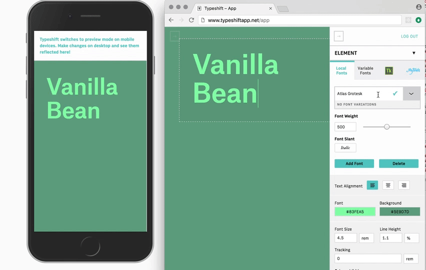
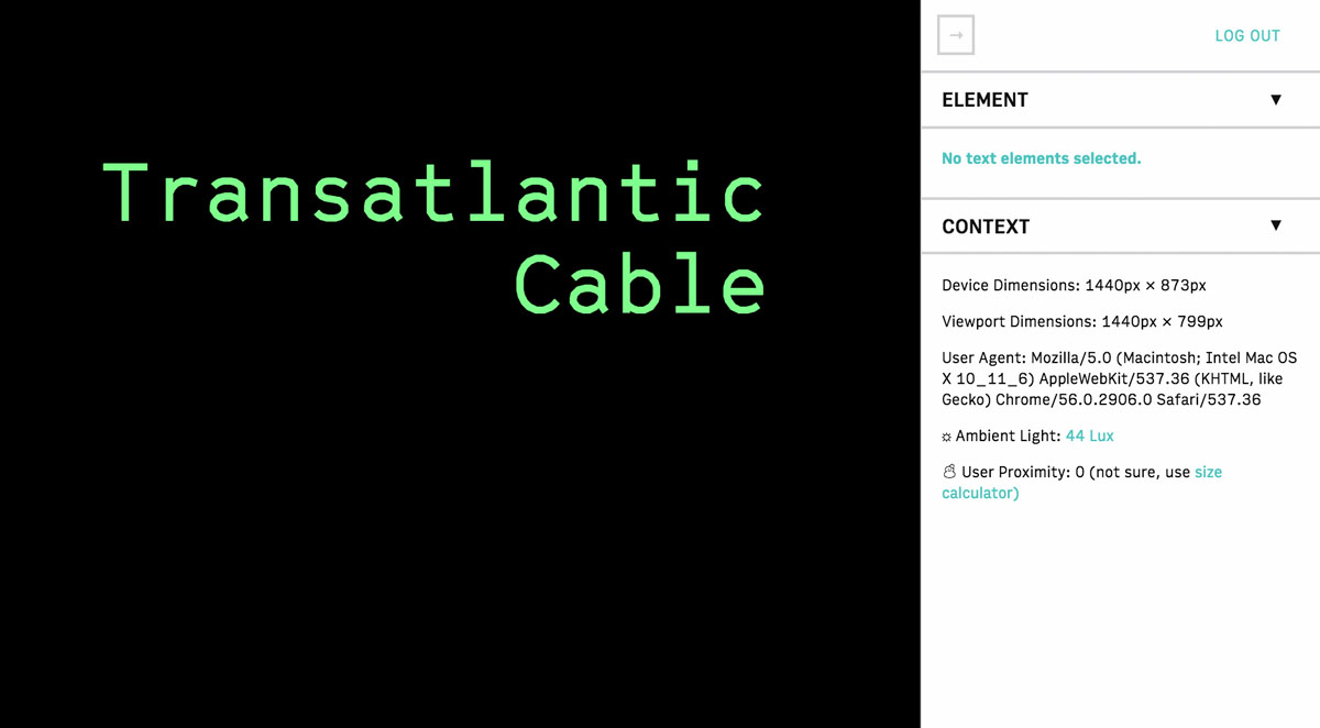
The context panel also gives you general information about your device, including viewport size and user agent.